You have placed your lead generation form on your landing page but it’s not converting visitors considerably. Perhaps your lead gen form falls short of design elements, or your form CTA text isn’t appealing enough to turn on your visitors.
No matter the reason, you need a way out to improve your conversion rate, resulting in higher sales. Luckily for you, I have put together 10 fruitful lead form conversion rate optimization tips to help you generate qualified leads or prospects for your business.
Form Conversion Rate Optimization Explained
When a website visitor fills out a form on your website landing page or any other webpage and submits the form, a form conversion occurs. The form submission can entail subscribing to your newsletter, signing up for a free trial, webinar, and resource download, or making a purchase.
Form conversion rate optimization is the process of enhancing the design and functionality of lead generation forms to increase the number of submissions. The optimization efforts include testing various form designs & layouts, reducing the number of form fields, placing a clean CTA, and more.
Perks of Lead Form Optimization
Optimizing your lead capture form means you are boosting the chances of your lead generation to pay off, thereby converting into paying customers. But you can snag more benefits by optimizing your lead form.
- Boost the quality of leads with improved user experience
- Encourage more visitors to fill out your lead capture form
- Crisp and clear instructions smoothen user navigation
- Features like auto-fill and error messages can increase the chances of successful submissions
… and more!
10 Lead Form Conversion Rate Optimization Tips
If you want to optimize your underperforming form conversion rate, you must improve site visitors’ experience with the landing page and the lead gen form.
The tips below focus exactly on this point and advise you on how to enhance form design, layout, and messaging uniquely.
Incorporate the Right Number of Form Fields
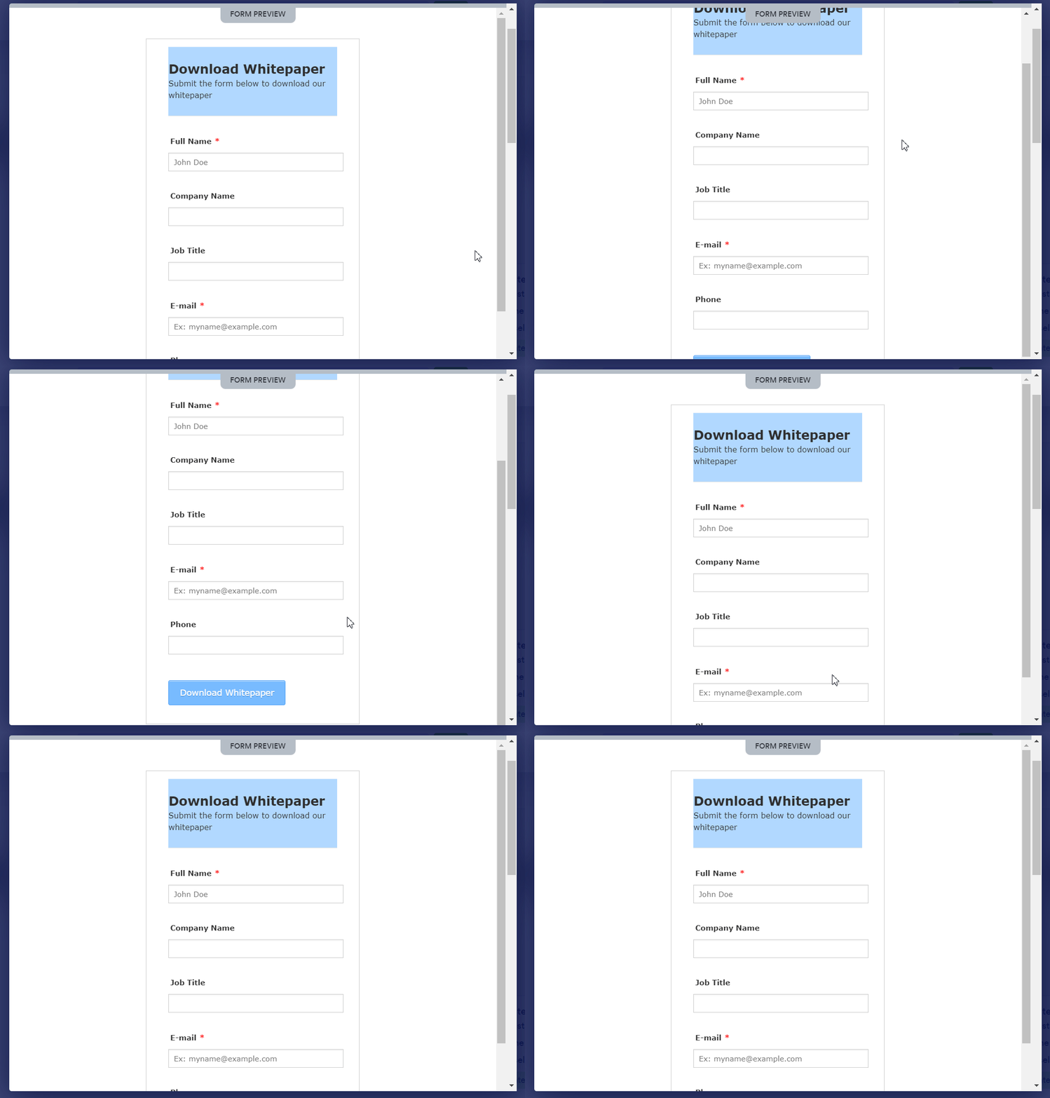
Your form should contain only those fields that are unskippable. Neither short nor long! Of course, that depends on the type of offer you are providing. If your offer entails simple free checklists, you can just add first name, last name, and email fields to your form.

But if you are offering salient lead magnets like an ebook or whitepaper, you can include additional details like company name, address, etc. as these offers hint that leads are in the research process.
If you have scores of leads to filter from, you can add further form fields to help your sales reps better qualify each lead and easily identify prospects. Additional form fields may reduce the lead quantity, but generated leads are likely to be qualified ones.
Position Your Lead Form Above the Fold
Visitors always want to receive value from websites with minimal effort. The less they scroll down, the higher the chances they will engage with your form. So, place your lead form above on your landing page, to yield results from your lead generation process.
Make Your Form Headline a CTA
The first text visitors will view in the lead form is the headline. So, you must grip them from the outset to create chances of conversions. The best way to engage your visitors is to make your headline a call to action. The CTA in the headline will inform the visitors what they will get by submitting the form.

What CTA to write in the headline depends on the offer you are making. But you can write your CTA in the following ways to blow away your visitors —
- Start Your Free Trial Now
- Sign Up for the Webinar
- Book Your Seat for the Event
- Get Your Free Coupon
- Yes, I Want This Voucher
- Download the Ebook
- Claim Your Discount Now
- Try the Free Version Now
- Make Your Purchase Now
Design Your Lead Form with a Perfect Layout
The layout of your form creates a psychological impact on visitors’ minds. So, you must set all the form elements keeping visual appeal in mind. This will also encourage users to engage with the form. Keep an eye on the following factors while designing your lead form —

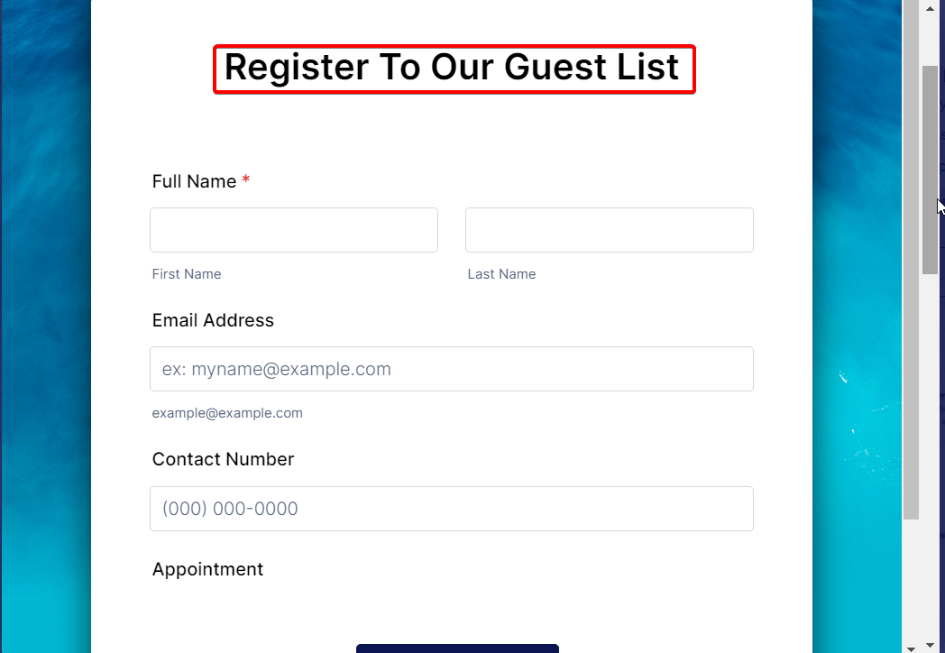
- Lay form labels on top of the corresponding input fields
- Align the size of input fields to the length of the expected answers
- Avoid asking more than one question in a single row
- Don’t split a form into more than 1 column
Focus on Mobile-friendliness
Statista reports the number of smartphone users in the world in 2023 is 6.92 billion, meaning 85.74% of the world’s population owns a smartphone.
As time progresses, the number of smartphone users is escalating globally. Chances are, most of your website visitors come to your landing page from their smartphones. So, you must optimize your lead generation form for the mobile to make a perfect display on mobile devices.

To make your lead form mobile-friendly and responsive, keep your form minimal, use drop-down lists when possible, keep your “Submit” button easy to touch, and speed up your form loading speed.
MetForm generates lead-capture forms, ensuring all the above factors which keep forms mobile-friendly. So, it can be a perfect lead-generation form builder for you.

Run an A/B Test to Choose the CTA Button Color
Your form CTA button color packs a punch in the minds of visitors. No matter what your lead form’s call to action is, the right CTA button color can convert visitors. Obviously, color choice differs from person to person.
But for your audience, there can be a color that will grip most of your target audience. Some studies reveal that red is the highest-performing color. But that doesn’t mean that colors like blue, green, and orange don’t draw attention.
By running an A/B test, you can figure out which color is optimal for your lead form. Use colors like red, green, blue, orange, etc. in your CTA button, keeping all the other elements constant. Then, track which version drives the maximum conversions. So easy, isn’t it?
Don’t Overlook Social Proof
Speaking frankly, clicking the “Submit” button by your visitors isn’t gonna happen automatically. There must be some influential factors to convert your visitors. One of the proven tactics can be leveraging social proof on your landing page.

Showing social proof to your landing page visitors can do wonders for your offers. With social proof, the visitors will find other people opting for your offers, which will psychologically influence them to click the “Submit” button. Examples of social proof text are shown below —
- 98% of first-time users reveal high satisfaction with our product
- Over 30k people have downloaded our ebook
- Mark from “ABC” company has subscribed to our email newsletter
- WordPress expert “X” considers our daily email crucial for his/her vast knowledge of the industry
- Sara, the CEO of the reputed company “Z” just purchased GetGenie
To display social proof elements, you can make use of various top-notch social proof apps. For example, you can leverage TrustPulse to showcase popup notifications on your landing page and maximize the chances of conversions.
Refer to Your Privacy Policy
Having hesitation while sharing personal info online is common among most people. To allay their concern and gain trust, share the key portion of your privacy policy with them in the lead form. For details, link to your “Privacy Policy” page in the form.
If you have no idea about what to incorporate in the “Privacy Policy” page, refer to the privacy policies of credible websites like HubSpot.
Don’t Forget to Analyze Your Results
Your efforts to optimize form conversions are unlikely to pay off if you don’t know what’s working and what isn’t. Every time you run a campaign, you must analyze its outcome to know the exact behavior of your site visitors.
Luckily for you, Hotjar allows you to track the key activities of your site visitors through heatmaps, including where they looked on the site before submitting the form, which URL led them to your landing page, and which part of your landing page they spent the bulk of their time.
These insights will help you get hold of the factors that significantly contribute to the form submissions & conversions and set up them accordingly.
Go for the Multi-page Lead Forms
Lead forms stretching to multiple pages have a higher average conversion rate than a single page. Not just my words, rather statistics prove that.
Notify Visitors surveyed, multi-page forms generate average conversions of 13.85% whereas single-page forms convert by 4.53%.
So, opt for multi-page or multi-step lead forms as opposed to single-page forms.
It’s Your Turn
Now that you know the actionable lead form conversion rate optimization tips for your landing page. No matter what your offer is, implement the above actions to make a difference in your marketing campaigns.
Keep in mind that lead form conversion rate optimization is a taxing issue and there is no silver bullet to it. You have to go through trial and error to figure out the difference-makers in your form conversion rate optimization.
The key to your success is user satisfaction and for that, spice up your landing page & lead form design, clear your messaging, and create a positive impression in users’ minds, so they automatically tend to hit the “Submit” button.


